Check Out DroidForums' New Look! Site-Style Redesigned!

dgstorm

Editor in Chief
Staff member
Premium Member
Joined
Dec 30, 2010
Messages
10,991
Reaction score
3,961
Location
Austin, TX
redesign-website.jpg

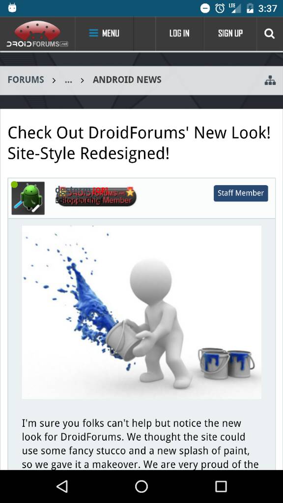
I'm sure you folks can't help but notice the new look for DroidForums. We thought the site could use some fancy stucco and a new splash of paint, so we gave it a makeover. We are very proud of the awesome new look, and hope you like it too! Feel free to post your comments about the new graphics in the thread below.

Of course, during the transition phase of changing over to the new custom template, there might be a few hiccups too, so be sure to sound off if there is something missing or out of place. As always, we want to evolve DroidForums to make sure it stays your favorite internet home for Android related news, discussions and entertainment!
 

LoneWolfArcher

Silver Member
Joined
Dec 29, 2009
Messages
1,808
Reaction score
481
I fear change. However, I remember the last change, at first I didn't like it (because it was different) and then I loved it. I think this will grow on me too.
 

danDroid

Administrator
Staff member
Joined
Oct 20, 2009
Messages
2,785
Reaction score
440
The last update we did (a few years back) was a major Software conversion. This is just a minor update with a new skin on top of it. It should function the same as the old site, however you should notice a few extra features. Just let us know if you have any questions or can't find something the old site had.
 

Mustang02

Diamond Member
Joined
Aug 8, 2010
Messages
7,531
Reaction score
5,017
Location
Ohio
Current Phone Model
Nexus 6P/5X
You may want to look at the mobile CSS portion. Your user titles are messed up.

26a19f89c78d8fb9f4934d8d5680f018.jpg
 

liftedplane

Gold Member
Joined
Jan 15, 2011
Messages
2,303
Reaction score
793
Location
Washington State
At first I Was like... am I at the right site? then I noticed the logo...

I'm not sure how much I like it right now, but I'm sure I'll grow to love it. There's already certain things jumping out at me I like more.

Great job on the new look guys.
 

Jonny Kansas

Administrator
Staff member
Rescue Squad
Joined
Jan 21, 2010
Messages
16,740
Reaction score
7,355
Location
Michigan's Upper Peninsula
Website
www.google.com
Current Phone Model
Pixel XL
Twitter
jonny_ks
At first I Was like... am I at the right site? then I noticed the logo...

I'm not sure how much I like it right now, but I'm sure I'll grow to love it. There's already certain things jumping out at me I like more.

Great job on the new look guys.
It definitely grows on you. Once they got close to ready to debut it to the entire forum, they let the mod team get a sneak peek. I used it for a few days before they took it down & made some final tweaks.

Sent from my Nexus 6P using Tapatalk
 

Mustang02

Diamond Member
Joined
Aug 8, 2010
Messages
7,531
Reaction score
5,017
Location
Ohio
Current Phone Model
Nexus 6P/5X
@Mustang02 - Should be fixed now!
That appears to be fixed. Here are a couple other things.

Top square - Why the wasted screen space? You can get about 25pixels from top back.

Progress trophy text is too transparent.
Screenshot-2016-06-22-17.13.jpg


To me the blue is too light. It's hard to differential against the light blue backgrounds. Right column seems to be too big taking away from the main forum section as well.
 

johnomaz

Silver Member
Joined
Jul 12, 2010
Messages
3,187
Reaction score
633
Location
Central Valley, California
Current Phone Model
Google Pixel 2XL
I like everything except the fonts used "NEWS" "FORUMS" "ACTIVE TOPICS" "GALLERY". The rest however I like. A darker theme is welcomed.
 

Mustang02

Diamond Member
Joined
Aug 8, 2010
Messages
7,531
Reaction score
5,017
Location
Ohio
Current Phone Model
Nexus 6P/5X
Right column spacing.

Screenshot-2016-06-22-17.26.jpg


****
Should the "New" Indicator be in the MessageContent Div?
 
Last edited:

gadgetrants

Senior Member
Joined
Jul 28, 2010
Messages
1,286
Reaction score
197
Current Phone Model
Google Pixel
Top square - Why the wasted screen space? You can get about 25pixels from top back.
I agree, I'm seeing an awful lot of empty space:

Clipboard01.jpg


Here is a more compact alternative layout (based on 30 seconds of editing!):

Clipboard03.jpg


EDIT: Oh geez, now I realize I posted this before I noticed the "collapse" behavior when you scroll on a "FORUM" page. I feel like a mix of "RTFM" and "total plagiarizer"! :oops:

-Matt
 
Last edited:

jkaod

Gold Member
Joined
Feb 3, 2010
Messages
794
Reaction score
435
Noooooooooooo! Don't change! Where is my old friend? Cosmetic surgery sucks! Ok, rant over. I like the change now. Looks just lovely guys!
 
Top